Logo design and business card for a small business in Puerto Vallarta, Mexico. This client will stock your condo with food and drink so you can relax on vacation. I used an authentic Mexican tile background to symbolize a kitchen. The font Ink Bandits Script was used for the "Pig Out" text. I liked the way the G and O curled like a pig tail. Thirsty Soft is the secondary font, which has the same swirly feel, and Univers is used for contact information. A website was also built: www.pigoutgroceries.com.
This blog is dedicated to type and design. My work is featured here, with commentary explaining the design process and typefaces used. Thank you for your interest!
Thursday, August 2, 2018
Pig Out Groceries
Logo design and business card for a small business in Puerto Vallarta, Mexico. This client will stock your condo with food and drink so you can relax on vacation. I used an authentic Mexican tile background to symbolize a kitchen. The font Ink Bandits Script was used for the "Pig Out" text. I liked the way the G and O curled like a pig tail. Thirsty Soft is the secondary font, which has the same swirly feel, and Univers is used for contact information. A website was also built: www.pigoutgroceries.com.
Wednesday, June 15, 2016
SAL Golf Tournament 2016
Another design for the Sons of the American Legion. This is for their annual Golf Tournament. The design utilizes some stock clip art and features the fonts Bernard Condensed and Univers.
Kayleigh and Sean's Wedding Invitations
The bride and groom requested something simple and elegant using silver or gray.
Here is the solution they chose. I used Roseround for the script font and Minion for the supporting text. Stock art swirls were screened back and added for interest. The back of the card is a simple gray with the same swirl added much larger and bleeding off the page.
Here is the envelope design.
The response cards were designed to match in a smaller size.
Here is the response envelope design.
Wednesday, April 27, 2016
Kayleigh and Sean's Save the Date Postcard
This project was a lot of fun. The couple asked for a simple and elegant solution for their "Save the Date" postcards utilizing gold, silver and gray with black and white photography.
This solution features the font Sugarbush. I added a fun swirl in the background that mimicked the font. I applied a photo filter for special effect.
Here is a classic look using the fonts Felix Titling and Savoye Let Plain. I added an elegant diamond pattern to the background.
Another fun design with the font Sugarbush and a pretty repetitive texture.
Have Heart Regular is the featured font here.
I chose to include this option because the photo really showed off their eyes! The classic font Roseround is used, and a pretty lace background was added for interest.
Here is the design my clients chose. Again, we have the font Roseround along with a pretty flourish for interest.
Monday, April 11, 2016
The Fierce Heart
This is the cover of a book I designed for Anne Zick. It was a wonderful project to be involved in. Anne had written many poems and she and I worked together to design this book. I had it printed in a small press run for friends and family. I utilized stock photo imagery and the font used was Kaligraf Latin for its Celtic feel. She past away shortly after the book was printed.
Here is a sample of the interior pages.
The woman in the photo is Anne Zick, standing with her husband, Edward.
Elevations Credit Union Mural
This was a local design contest to paint a mural on a wall of shipping crates in a conference room at a bank. The wall was 28' long. I submitted my design and was selected as a finalist. The general public then voted on their favorite and a winner was selected. It wasn't me. Anyway, the design was a simple rendition of the view of Longs Peak from Longmont, with different shades of blue illustrating the foothills. Swirls were added to the sky to simulate the wind (it gets pretty windy here!) with pine trees in the foreground. Again, this design will only see the light of day on this blog.
Thursday, April 7, 2016
A Slow Tour Through France Book Cover
I'm not a big fan of design contests. Loads of graphic artists design the same thing and submit their ideas. The client looks them over and chooses ONE to be the "winner." The other designers really are the losers, because they spent their time and talent on a project they will never get paid for and will never see the light of day. Bull crap. But, every now and again, I participate just the same. Here is a book cover I designed through www.99designs.com. It's the story of a woman who travels across France on a bicycle. Her starting and ending points are marked with stars. It utilizes some stock imagery. The fancy font is Sugarbush Italic. The word "France" is set in Impact and there are raindrops within the text (the woman in the book encountered a lot of rain). Secondary text is set in the font Avenir. My design did not win, but alas, it is seeing the light of day on this blog. :)
Angela & Brandon's Wedding Invitation
This wedding had a rustic theme, utilizing burlap and lace. The theme colors were pink and orange. I incorporated multiple stock photo images and created the collage of flowers, lace, burlap, handmade paper, roses and ribbon. I added a little silver charm and designed a fun engraving using the bride and grooms initials and a heart. The font used was Barrett Ironwork. I also repeated that design across the top, alternating pink and orange. The rest of the invitation was set in the Italianno font. An RSVP card was designed using the same style.
Wednesday, February 10, 2016
San Diego Marine Recycling
Here is a logo design for a boat recycling business in San Diego, along with the front side of the business card. "San Diego" is set in the font Italianno. "Marine Recycling" is set in Aachen. Waves were added for interest and the dolphin appears to be playing with the dot on the "i".
This is the front side of the business card.
Freedom Ink
Here is a business card design for a local tattoo and piercing artist. A basic black & white theme was requested.
The image of the skull and text for the front of the card was supplied. I incorporated an american flag along with the skull and text image into the background. The clover was added in memory of the previous owner, who operated the shop under the name "White Clover."
The back side uses the Algerian font. The flag on the backside is an image of the tattoo on the back side of the clients hand.
The image of the skull and text for the front of the card was supplied. I incorporated an american flag along with the skull and text image into the background. The clover was added in memory of the previous owner, who operated the shop under the name "White Clover."
The back side uses the Algerian font. The flag on the backside is an image of the tattoo on the back side of the clients hand.
2" stickers were later designed and ordered.
Thursday, October 8, 2015
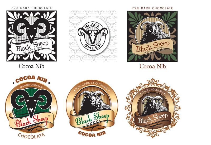
Black Sheep Chocolate
This logo was designed for a start-up company who wanted to produce their own organic chocolate bars. The logo above was my first, original idea. It utilizes the font FontleroyBrown, a face that the client picked out themselves. I incorporated parts of the capital "S" in the horns of the sheep, giving it a unique style that mimicked the font.
We looked at many alternate ideas. None of these ideas made the final cut.
Here is the design that won my client's hearts. . . starting with the original sketch. . .
Below is a selection of different labels for the chocolate bars. . .
And the head only which will be stamped onto the chocolate.
50 Shades of Jade
My client Jade Beaty contacted me to revise her business card. I used the existing logo that I designed for her some time ago. The background image is royalty free stock imagery. The fonts used are Jellyka Delicious Cake and Antique Olive.
Wednesday, September 30, 2015
2015 SAL Golf Tournament Tshirt Design
I never grow tired of designing these tshirts. It is so fun to walk into the American Legion and see them worn by so many. This year's design features the font Shogun, which can be found here: http://www.letterheadfonts.com/fonts/shogun.php
If you are a graphic designer, and like very cool fonts, this website is highly recommended.
Tuesday, September 23, 2014
Sadowski Enterprise
Monday, September 22, 2014
Enlow Auto Care
This client asked me if I could "do something" with his business card. I took the star and "e" combination of the existing logo and created a new one. The grunge blue background was added for color and interest. The logo rests on top and has a slight transparency. The reversed text at the bottom gives it a nice foundation.
Monday, December 10, 2012
Cathie Beck Public Relations
My very talented friend, Cathie Beck, contacted me about designing a logo for her new public relations venture. She is an accomplished writer and journalist, and wanted a simple design incorporating her initials. I chose the Tiffany typeface for it's classic serif. I especially liked the unique look of the "e" and "k". Two subtle colors were used to give it a timeless, traditional feel.
A Facebook cover image was also created to give a more visual representation of the business offerings. The same two colors were utilized in the background image and duotones were created.
Wednesday, August 22, 2012
Golf Tournament 2011
Logo for another t-shirt design. The font used on "Fore!" is Harliquin with a modified capital "F." "19th Annual" and "June 12, 2011" are set in a fun text called Jiggy Roman. I usually don't like to mix two different fonts that are so unique, but the word "Fore!" kind of took on a life of its own as a graphic element and didn't compete much. Remaining text is set in Impact.
Subscribe to:
Posts (Atom)