This is the front side of the business card.
This blog is dedicated to type and design. My work is featured here, with commentary explaining the design process and typefaces used. Thank you for your interest!
Wednesday, February 10, 2016
San Diego Marine Recycling
Here is a logo design for a boat recycling business in San Diego, along with the front side of the business card. "San Diego" is set in the font Italianno. "Marine Recycling" is set in Aachen. Waves were added for interest and the dolphin appears to be playing with the dot on the "i".
Freedom Ink
Here is a business card design for a local tattoo and piercing artist. A basic black & white theme was requested.
The image of the skull and text for the front of the card was supplied. I incorporated an american flag along with the skull and text image into the background. The clover was added in memory of the previous owner, who operated the shop under the name "White Clover."
The back side uses the Algerian font. The flag on the backside is an image of the tattoo on the back side of the clients hand.
2" stickers were later designed and ordered.
Thursday, October 8, 2015
Black Sheep Chocolate
This logo was designed for a start-up company who wanted to produce their own organic chocolate bars. The logo above was my first, original idea. It utilizes the font FontleroyBrown, a face that the client picked out themselves. I incorporated parts of the capital "S" in the horns of the sheep, giving it a unique style that mimicked the font.
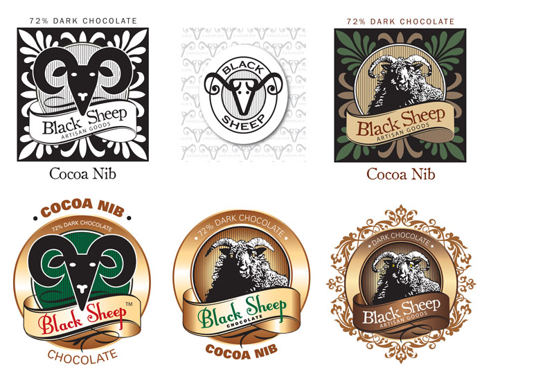
We looked at many alternate ideas. None of these ideas made the final cut.
Here is the design that won my client's hearts. . . starting with the original sketch. . .
Below is a selection of different labels for the chocolate bars. . .
And the head only which will be stamped onto the chocolate.
50 Shades of Jade
My client Jade Beaty contacted me to revise her business card. I used the existing logo that I designed for her some time ago. The background image is royalty free stock imagery. The fonts used are Jellyka Delicious Cake and Antique Olive.
Wednesday, September 30, 2015
2015 SAL Golf Tournament Tshirt Design
I never grow tired of designing these tshirts. It is so fun to walk into the American Legion and see them worn by so many. This year's design features the font Shogun, which can be found here: http://www.letterheadfonts.com/fonts/shogun.php
If you are a graphic designer, and like very cool fonts, this website is highly recommended.
Subscribe to:
Posts (Atom)