Thursday, October 8, 2015

Black Sheep Chocolate


This logo was designed for a start-up company who wanted to produce their own organic chocolate bars. The logo above was my first, original idea. It utilizes the font FontleroyBrown, a face that the client picked out themselves. I incorporated parts of the capital "S" in the horns of the sheep, giving it a unique style that mimicked the font.


We looked at many alternate ideas. None of these ideas made the final cut.

Here is the design that won my client's hearts. . . starting with the original sketch. . .


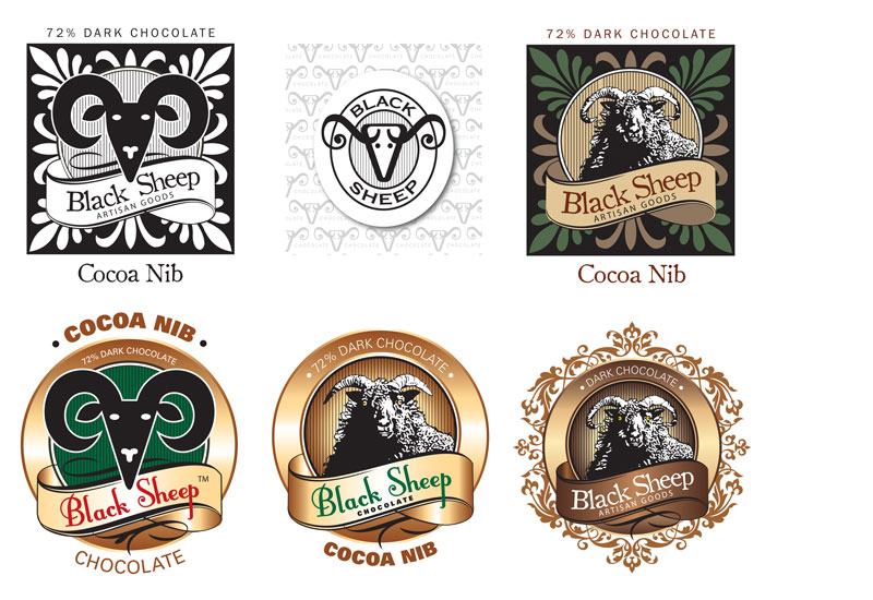
Below is a selection of different labels for the chocolate bars. . .
And the head only which will be stamped onto the chocolate.


50 Shades of Jade

My client Jade Beaty contacted me to revise her business card. I used the existing logo that I designed for her some time ago. The background image is royalty free stock imagery. The fonts used are Jellyka Delicious Cake and Antique Olive.


Wednesday, September 30, 2015

2015 SAL Golf Tournament Tshirt Design

I never grow tired of designing these tshirts. It is so fun to walk into the American Legion and see them worn by so many. This year's design features the font Shogun, which can be found here: http://www.letterheadfonts.com/fonts/shogun.php
If you are a graphic designer, and like very cool fonts, this website is highly recommended.

2014 SAL Golf Tournament Tshirt Design

I had a request to re-visit the gopher theme from many years ago. Here it is.

2013 SAL Golf Tournament Tshirt Design

Another entry into the annual tournament tshirt design archives.

Tuesday, September 23, 2014

Sadowski Enterprise


Here is a redesign for a local contractor. His business card got the job done, but I couldn't wait to improve on it and add some personality. I started with a logo design using the initials of the company, a simple solution using the typeface Black Oak. I modified the "S", adding a hammer head, and added a subtle gradient. The company name is set in Univers Bold Extended. I also rewrote the tag line so it didn't begin with the word "no". The tagline and name are set in a script typeface called Italianno. The phone number is set in Aachen, and a gradient was also added to it. I chose it because it has big, thick serifs that complimented the logo well. The email address is set in Univers Light. Notice how I capitalized "Enterprise" so it would be more easily read. The background is a royalty free stock image from Thinkstock. It is a photo of a plastered wall with a shadow being cast from a metal screen of some sort. I really liked the warm glow of the photo. I added a reverse beveled white background with a drop shadow and brought back the opacity so the background texture peaked through. A postcard was also designed to tie into the business card design perfectly. I also put together a very simple website: www.sadowskienterprise.com.


Monday, September 22, 2014

Enlow Auto Care


This client asked me if I could "do something" with his business card. I took the star and "e" combination of the existing logo and created a new one. The grunge blue background was added for color and interest. The logo rests on top and has a slight transparency. The reversed text at the bottom gives it a nice foundation.